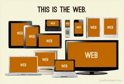
We will learn how to implement mobile sites in asp.net mvc using jQuery mobile mvc or mobile-specific views for the website in asp.net mvc using jquery mobile mvc NuGet package. In today's fast-growing world, people have different devices such as Desktop, Mobile phone, tablet, phablet, and Smart TV. These devices may have different operating systems, but the internet is common to access all devices. Creating a native application for all these devices may cost more than just creating a mobile-based website, and the website can be viewed for all different devices browsers.
Most important meta tag that helps adaptive rendering our site is the viewport Meta tag. If you open any desktop site on your mobile, it is so large that you need to scroll the enter page to see it, and the text for reading is so small that it can’t be read properly. The viewport helps us render page according to mobile size. To define viewport, we need to add a viewport Meta tag in the <head> section of your HTML page like as shown below.
<meta name="viewport" content="width=device-width"/>
The following are the properties of the meta tag.
| Property | Description |
|---|---|
| width | The width of the virtual viewport of the device. |
| device-width | The physical width of the device's screen. |
| height | The height of the "virtual viewport" of the device. |
| device-height | The physical height of the device's screen. |
| initial-scale | The initial zoom when visiting the page. 1.0 does not zoom. |
| minimum-scale | The minimum amount the visitor can zoom on the page. 1.0 does not zoom. |
| maximum-scale | The maximum amount the visitor can zoom on the page. 1.0 does not zoom. |
| user-scalable | It allows the device to zoom in and out. Values are yes or no. |
The following are the different devices available today, and we need to make the application compatible with all devices.
To build a mobile-based application, the ASP.NET framework has built-in support. Asp.net MVC has a “Mobile Application” template that can develop only a mobile-based Web Application. If we want to develop a site for (desktop and mobile), we will develop a desktop edition first. After that, we will modify the site to work for mobile using “Install-package jQuery.Mobile.MVC”.
If we try to implement a mobile site, it’s impossible to access the site through mobile and desktop. At that time, your site might break (will not look proper) for that let's begin with creating a site using an Internet application template in MVC. Let’s start by creating an MVC internet application for desktop and mobile both.
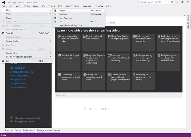
Let's start with creating a new asp.net mvc application for both desktop and mobile for that Open visual studio à Go to File à Select New à Select Project.
After that, you will see a new dialog for selecting your Template and Project type. From Templates, select Visual C# à inside that select Web and select project type as ASP.NET MVC 4 Web Application. Here we are giving the name “TutorialMobilesite” finally, click on the OK button.
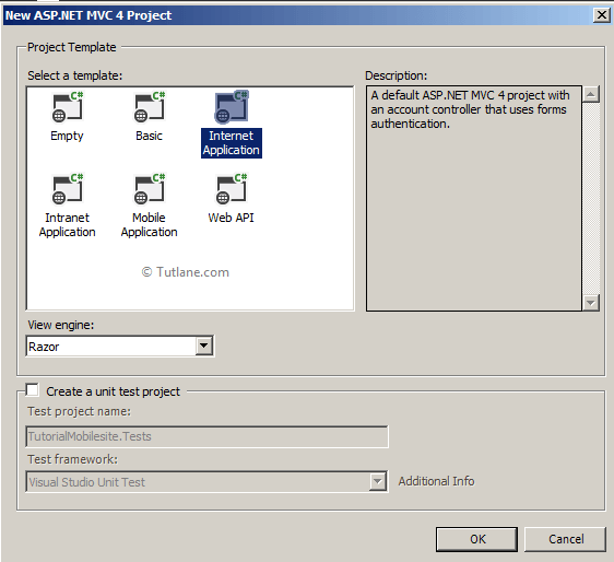
After naming and click on the OK button, now new dialog will pop up for selecting a template in that Select Internet Application template and set view engine as Razor. We will not create Unit testing for this project; hence, do not check this option and finally click the OK button like as shown below.
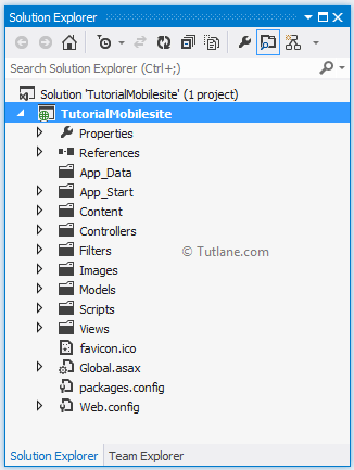
After selecting all options as discussed above, click the OK button, our Project will be created like as shown below.
After completing displaying the project structure, let’s run our application that we created that will be as shown below.
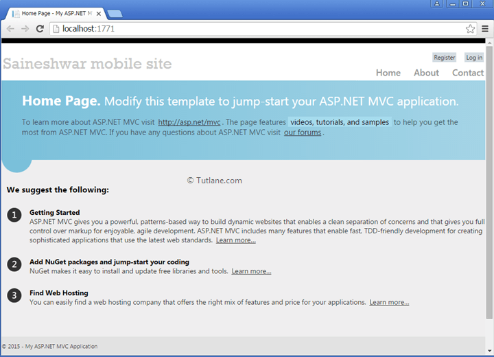
It’s working fine now in desktop view. Let’s start with creating a new Model, Controller, and View for creating new forms, and we are going to view it on desktop and mobile.
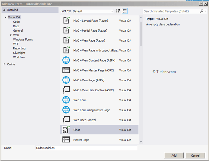
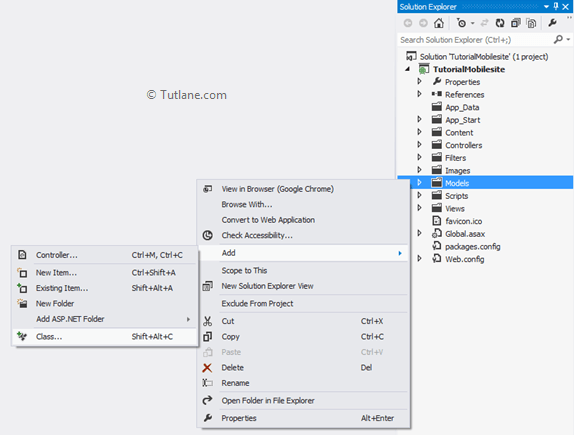
To add a model, in solution explorer right click on Model folder and select Add then inside that select Class and then Name the class as OrderModel and finally click on the Add button to create Model.
Now give a name to the class file as "OrderModel" and click the Add button like as shown below.
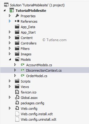
After creating the OrderModel class, it creates in the Model folder. Now inside OrderModel class, we are going to add some properties.
using System;
using System.Collections.Generic;
using System.ComponentModel.DataAnnotations;
using System.Linq;
using System.Web;
namespace TutorialMobilesite.Models
{
public class OrderModel
{
[Key]
public int OrderID { get; set; }
[Required(ErrorMessage = "Enter Order Name")]
public string OrderName { get; set; }
[Required(ErrorMessage = "Enter Order Price")]
public int? OrderPrice { get; set; }
[Required(ErrorMessage = "Enter Order Date")]
public DateTime? OrderDate { get; set; }
}
}
After adding the Countries Model now, we will use the Code First Approach for accessing the database. We will add class DbconnectionContext, which will be inheriting from DbContext.
For adding context class In Solution Explorer, right-click the Models folder à Select Add à then select Class once click class new dialog will pop up the class DbconnectionContext and click Add once we add a content file that will be like as shown below.
Open the DbconnectionContext file. We see a simple class with DbconnectionContext inherit from DbContext Class after this step in DbconnectionContext Constructor call base class (DbconnectionContext) and provide connection string in it.
using System;
using System.Collections.Generic;
using System.Data.Entity;
using System.Linq;
using System.Web;
namespace TutorialMobilesite.Models
{
public class DbconnectionContext : DbContext
{
public DbconnectionContext()
: base("DefaultConnection")
{
}
public DbSet<OrderModel> OrderModel { get; set; }
}
}
We will add a connection string in the web.config file because we need to tell it where to create the Database.
<connectionStrings>
<add name="DefaultConnection" providerName="System.Data.SqlClient" connectionString="data source=SAI-PC; initial catalog=OrderDB1; persist security info=True; user id=sa; password=Pass$123; App=EntityFramework" />
</connectionStrings>
After completion of database part now let’s move towards adding Controller.
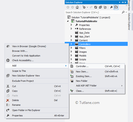
To add controller, right-click on the Controller folder, select Add from the list, and inside that select controller like as shown below.
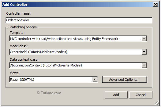
After selecting the controller, a new dialog will pop up with the name Add Controller. In that mention, name as "OrderController". We will select the MVC controller with read/write actions and views using Entity Framework in the template section. In model class, we will select OrderModel that we created earlier and select data context class as DbconnectionContext.
Finally, click on the Add button to create OrderController. After clicking on the Add button, scaffolding will generate all action methods and code for insert, update, delete, along with all view regarding Action Method.
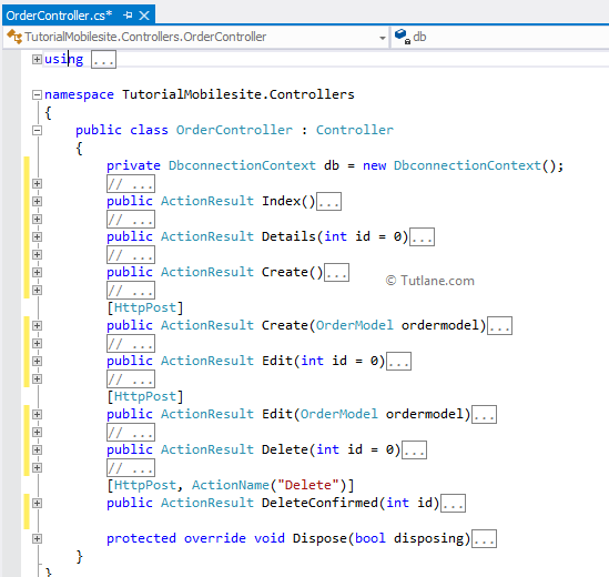
Following is the snapshot of how our Controller will look after using the scaffolding technique.
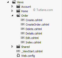
In the view folder, look at the Order view for the files which are generated.
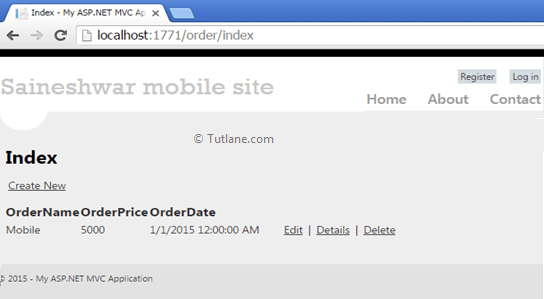
Now save and run your application to check we will access the index page of the order controller to check how its design looks like in the browser.
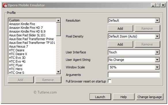
If you look at the same page on mobile, it will not look proper. To view in mobile download [Opera Mobile Emulator] from the given link and install http://www.opera.com/de/developer/mobile-emulator. After installing Opera Mobile Emulator, here is a view of how it looks. On the right-hand side of Profile, there is a list of Mobile phone names available from that select anyone and test you can add new phones into this Emulator.
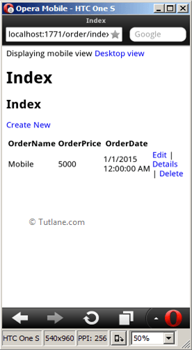
Now open the index page of the application on the phone; it won't look proper.
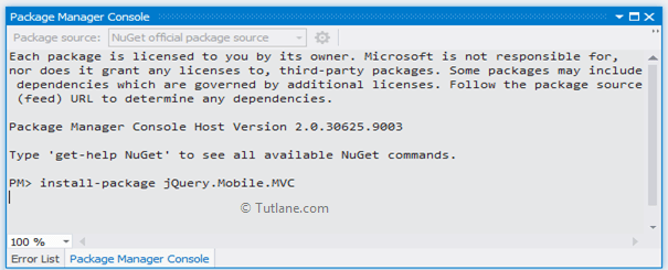
Now design an application to work on Mobile. Let's Install jQuery.Mobile.MVC Package from NuGet commands like as shown below.
After installing it will open a text file to say add BundleMobileConfig.RegisterBundles(BundleTable.Bundles); to Application_Start() in global.asax file. Now open Global.asax file and add BundleMobileConfig to Application_Start Method like as shown below.
public class MvcApplication : System.Web.HttpApplication
{
protected void Application_Start()
{
AreaRegistration.RegisterAllAreas();
WebApiConfig.Register(GlobalConfiguration.Configuration);
FilterConfig.RegisterGlobalFilters(GlobalFilters.Filters);
RouteConfig.RegisterRoutes(RouteTable.Routes);
BundleConfig.RegisterBundles(BundleTable.Bundles);
BundleMobileConfig.RegisterBundles(BundleTable.Bundles);
AuthConfig.RegisterAuth();
}
}
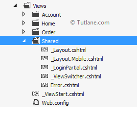
After installing jQuery.Mobile.MVC package following are the files (_Layout.Mobile.cshtml, _ViewSwitcher.cshtml), which are added inside the shared folder. By view switcher, users can switch from mobile view to desktop view and desktop view to mobile view.
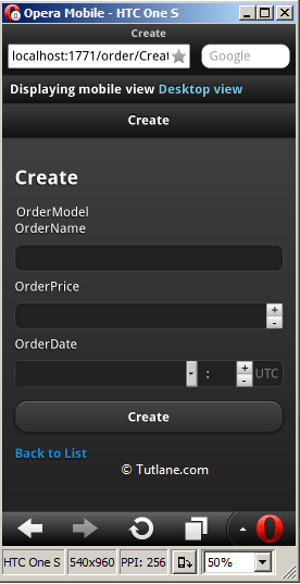
Now save and run the application and test in opera Mobile Emulator if check-in Opera Mobile Emulator view has changed a bit.

Now, if we click on Create New Button on this page, it gives an Error like as shown below.
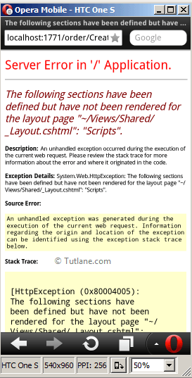
To resolve this Error, Remove or Comment this bit of code, which is given below.
@section Scripts {
@Scripts.Render("~/bundles/jqueryval")
}
Wow, it looks good. Now we don't require to write lots of code for doing this stuff to view on Mobile. All of this part will be handled by jQuery.Mobile.MVC package.
After this, if we check the similar websites in Windows OS or iPhone device, it will look different for handling that we will see Display Modes to display view based on mobile it requested for it. E.g., if the user requested Android phones, then the Android phone View must only display, and in the same way, if he is requesting a website from iPhone, then the iPhone view must only display the same to Windows. We are going to add DisplayModeProvider in the Global.asax file like as shown below.
DisplayModeProvider.Instance.Modes.Insert(1, new DefaultDisplayMode("WP")
{
ContextCondition = (ctx => ctx.GetOverriddenUserAgent()
.IndexOf("Windows Phone OS", StringComparison.OrdinalIgnoreCase) > 0)
});
DisplayModeProvider.Instance.Modes.Insert(1, new DefaultDisplayMode("iPhone")
{
ContextCondition = (ctx => ctx.GetOverriddenUserAgent()
.IndexOf("iPhone", StringComparison.OrdinalIgnoreCase) > 0)
});
DisplayModeProvider.Instance.Modes.Insert(1, new DefaultDisplayMode("Android")
{
ContextCondition = (ctx => ctx.GetOverriddenUserAgent()
.IndexOf("Android", StringComparison.OrdinalIgnoreCase) > 0)
});
Following is the complete code of the Global.aspx file after adding bundle config and display mode.
using System;
using System.Collections.Generic;
using System.Linq;
using System.Web;
using System.Web.Http;
using System.Web.Mvc;
using System.Web.Optimization;
using System.Web.Routing;
using System.Web.WebPages;
namespace TutorialMobilesite
{
// Note: For instructions on enabling IIS6 or IIS7 classic mode,
// visit http://go.microsoft.com/?LinkId=9394801
public class MvcApplication : System.Web.HttpApplication
{
protected void Application_Start()
{
AreaRegistration.RegisterAllAreas();
WebApiConfig.Register(GlobalConfiguration.Configuration);
FilterConfig.RegisterGlobalFilters(GlobalFilters.Filters);
RouteConfig.RegisterRoutes(RouteTable.Routes);
BundleConfig.RegisterBundles(BundleTable.Bundles);
BundleMobileConfig.RegisterBundles(BundleTable.Bundles);
AuthConfig.RegisterAuth();
DisplayModeProvider.Instance.Modes.Insert(1, new DefaultDisplayMode("WP")
{
ContextCondition = (ctx => ctx.GetOverriddenUserAgent()
.IndexOf("Windows Phone OS", StringComparison.OrdinalIgnoreCase) > 0)
});
DisplayModeProvider.Instance.Modes.Insert(1, new DefaultDisplayMode("iPhone")
{
ContextCondition = (ctx => ctx.GetOverriddenUserAgent()
.IndexOf("iPhone", StringComparison.OrdinalIgnoreCase) > 0)
});
DisplayModeProvider.Instance.Modes.Insert (1, new DefaultDisplayMode("Android")
{
ContextCondition = (ctx => ctx.GetOverriddenUserAgent()
.IndexOf("Android", StringComparison.OrdinalIgnoreCase) > 0)
});
}
}
}
After adding Display Mode provider to Global.asax, let’s add a view in Views Folder according to DefaultDisplayMode [WP, iPhone, Android].
We will add an Android view first copy the Create.cshtml file from the order folder inside view and paste in the same folder the name of view changes after pasting in the folder [Copy of Create.cshtml]. Now we are going to rename this file to [Create.Android.cshtml]. In the same way, we have to do for windows phone and iPhone.
Following is the image which shows our modes for windows, androdi and iphone [Create.Android.cshtml], [Create.WP.cshtml], [Create.iPhone.cshtml]
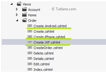
Now we have four views to display one for Desktop and others are for different Mobiles. Now change the page's header name in all views with their device name such that it can be easy to recognize. For e.g <h2>Iphone</h2>
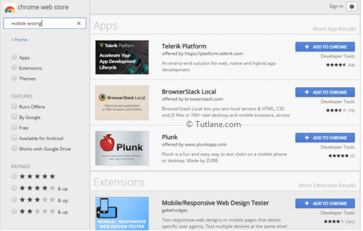
We have an extension in chrome for testing in iPhone and Windows that will help us do this. Just open chrome browser and from Menu select more tool inside that select extension, in the search box enter “mobile testing” and list select Mobile/Responsive web design Tester and add this extension to chrome.
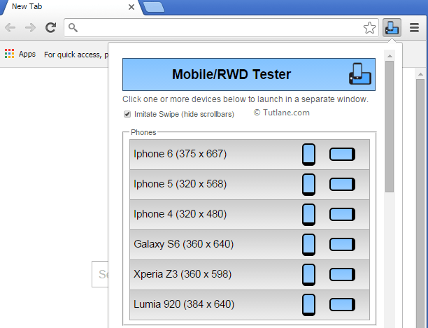
After adding, it gets added to the right corner of your browser window. Inside that, there is a complete list of mobile we can test like as shown below.
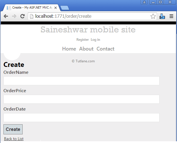
If we run applications on the desktop, our view will be like as shown below.
To test the website on mobile, open the page in a browser you want to test and then from [Mobile/RWD Tester] select the phone you want to test. We are first going to test android and iPhone that will be like as shown below.
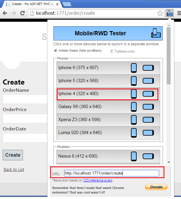
While testing in [Mobile/RWD Tester], we selected the Galaxy S6 phone, an Android phone for that an Android view has been popup. Similarly, we selected the iPhone 4 phone from [Mobile/RWD Tester] for that, an iPhone view has been popup. Following is the output render for both device view.

This is the magic which is done by JQuery.mobile.MVC package in asp.net mvc applications.