In the previous chapters, we learned how to setup highcharts library and how to create a chart with required configurations using highcharts library in our webpage. Now, we will learn how to create a solid gauge chart using highcharts library with examples.
Following is the example of creating a solid gauge series charts by setting the required chart properties using highcharts library.
<html>
<head>
<title>Highcharts Solid Gauge Chart</title>
<script src="https://code.jquery.com/jquery-3.4.1.min.js"></script>
<script src="https://code.highcharts.com/highcharts.js"></script>
<script src="https://code.highcharts.com/highcharts-more.js"></script>
<script src="https://code.highcharts.com/modules/solid-gauge.js"></script>
<script type="text/javascript">
$(function() {
var gaugeOptions = {
chart: {
type: 'solidgauge'
},
title: null,
pane: {
center: ['50%', '85%'],
size: '140%',
startAngle: -90,
endAngle: 90,
background: {
backgroundColor: (Highcharts.theme && Highcharts.theme.background2) || '#EEE',
innerRadius: '60%',
outerRadius: '100%',
shape: 'arc'
}
},
tooltip: {
enabled: false
},
// the value axis
yAxis: {
stops: [
[0.1, '#55BF3B'], // green
[0.5, '#DDDF0D'], // yellow
[0.9, '#DF5353'] // red
],
lineWidth: 0,
minorTickInterval: null,
tickAmount: 2,
title: {
y: -70
},
labels: {
y: 16
}
},
plotOptions: {
solidgauge: {
dataLabels: {
y: 5,
borderWidth: 0,
useHTML: true
}
}
}
};
// The speed gauge
var chartSpeed = Highcharts.chart('container-speed', Highcharts.merge(gaugeOptions, {
yAxis: {
min: 0,
max: 200,
title: {
text: 'Speed'
}
},
credits: {
enabled: false
},
series: [{
name: 'Speed',
data: [80],
dataLabels: {
format: '<div style="text-align:center"><span style="font-size:25px;color:' +
((Highcharts.theme && Highcharts.theme.contrastTextColor) || 'black') + '">{y}</span><br/>' +
'<span style="font-size:12px;color:silver">km/h</span></div>'
},
tooltip: {
valueSuffix: ' km/h'
}
}]
}));
// The RPM gauge
var chartRpm = Highcharts.chart('container-rpm', Highcharts.merge(gaugeOptions, {
yAxis: {
min: 0,
max: 5,
title: {
text: 'RPM'
}
},
series: [{
name: 'RPM',
data: [1],
dataLabels: {
format: '<div style="text-align:center"><span style="font-size:25px;color:' +
((Highcharts.theme && Highcharts.theme.contrastTextColor) || 'black') + '">{y:.1f}</span><br/>' +
'<span style="font-size:12px;color:silver">* 1000 / min</span></div>'
},
tooltip: {
valueSuffix: ' revolutions/min'
}
}]
}));
// Bring life to the dials
setInterval(function() {
// Speed
var point,
newVal,
inc;
if (chartSpeed) {
point = chartSpeed.series[0].points[0];
inc = Math.round((Math.random() - 0.5) * 100);
newVal = point.y + inc;
if (newVal < 0 || newVal > 200) {
newVal = point.y - inc;
}
point.update(newVal);
}
// RPM
if (chartRpm) {
point = chartRpm.series[0].points[0];
inc = Math.random() - 0.5;
newVal = point.y + inc;
if (newVal < 0 || newVal > 5) {
newVal = point.y - inc;
}
point.update(newVal);
}
}, 2000);
});
</script>
<style>
.outer {
width: 600px;
height: 200px;
margin: 0 auto;
}
.outer .chart-container {
width: 300px;
float: left;
height: 200px;
}
.highcharts-yaxis-grid .highcharts-grid-line {
display: none;
}
@media (max-width: 600px) {
.outer {
width: 100%;
height: 400px;
}
.outer .chart-container {
width: 300px;
float: none;
margin: 0 auto;
}
}
</style>
</head>
<body>
<div class="outer">
<div id="container-speed" class="chart-container"></div>
<div id="container-rpm" class="chart-container"></div>
</div>
</body>
</html>
If you observe the above example, we created a solid gauge series chart by using highcharts library with required properties.
When we execute the above highcharts example, we will get the result like as shown below.
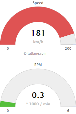
This is how we can create a solid gauge charts using highcharts library with required properties.