In the previous chapters, we learned how to setup highcharts library and how to create a chart with required configurations using highcharts library in our webpage. Now, we will learn how to create a combination chart by combining the multiple charts like dual axes, line and column charts using highcharts library with examples.
Following is the example of creating a combination chart (dual axes, line, and column) by setting the required chart properties using highcharts library.
<html>
<head>
<title>Highcharts Dual Axes, Line and Column Combination Chart</title>
<script src="https://code.jquery.com/jquery-3.4.1.min.js"></script>
<script src="https://code.highcharts.com/highcharts.js"></script>
<script src="https://code.highcharts.com/modules/exporting.js"></script>
<script src="https://code.highcharts.com/modules/export-data.js"></script>
<script type="text/javascript">
$(function() {
Highcharts.chart('container', {
chart: {
zoomType: 'xy'
},
title: {
text: 'Monthly Temperature & Rainfall in Tokyo'
},
subtitle: {
text: 'Source: WorldClimate'
},
xAxis: [{
categories: ['Jan', 'Feb', 'Mar', 'Apr', 'May', 'Jun',
'Jul', 'Aug', 'Sep', 'Oct', 'Nov', 'Dec'
],
crosshair: true
}],
yAxis: [{ // Primary yAxis
labels: {
format: '{value}°C',
style: {
color: Highcharts.getOptions().colors[1]
}
},
title: {
text: 'Temperature',
style: {
color: Highcharts.getOptions().colors[1]
}
}
}, { // Secondary yAxis
title: {
text: 'Rainfall',
style: {
color: Highcharts.getOptions().colors[0]
}
},
labels: {
format: '{value} mm',
style: {
color: Highcharts.getOptions().colors[0]
}
},
opposite: true
}],
tooltip: {
shared: true
},
legend: {
layout: 'vertical',
align: 'left',
x: 120,
verticalAlign: 'top',
y: 100,
floating: true,
backgroundColor: (Highcharts.theme && Highcharts.theme.legendBackgroundColor) || 'rgba(255,255,255,0.25)'
},
series: [{
name: 'Rainfall',
type: 'column',
yAxis: 1,
data: [49.9, 71.5, 106.4, 129.2, 144.0, 176.0, 135.6, 148.5, 216.4, 194.1, 95.6, 54.4],
tooltip: {
valueSuffix: ' mm'
}
}, {
name: 'Temperature',
type: 'spline',
data: [7.0, 6.9, 9.5, 14.5, 18.2, 21.5, 25.2, 26.5, 23.3, 18.3, 13.9, 9.6],
tooltip: {
valueSuffix: '°C'
}
}]
});
});
</script>
</head>
<body>
<div id="container" style="width: 100%; height: 400px;"> </div>
</body>
</html>
If you observe the above example, we created a combination chart by combining the multiple charts like dual axes, line and column charts using highcharts library with required properties.
When we execute the above highcharts example, we will get the result like as shown below.
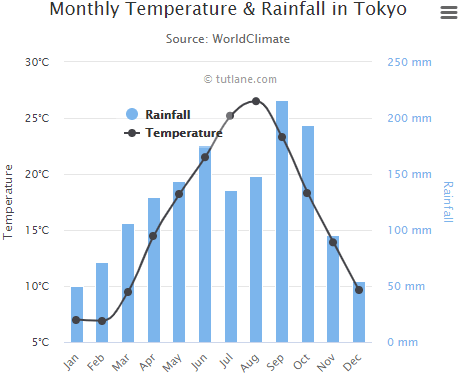
This is how we can create a combination chart using highcharts library with required properties.