In the previous chapters, we learned how to setup highcharts library and how to create a chart with required configurations using highcharts library in our webpage. Now, we will learn how to create a gauge chart or speedometer with dual axes using highcharts library with examples.
Following is the example of creating a gauge chart or speedometer with dual axes by setting the required chart properties using highcharts library.
<html>
<head>
<title>Highcharts Gauge with Dual Axes Chart</title>
<script src="https://code.jquery.com/jquery-3.4.1.min.js"></script>
<script src="https://code.highcharts.com/highcharts.js"></script>
<script src="https://code.highcharts.com/highcharts-more.js"></script>
<script src="https://code.highcharts.com/modules/exporting.js"></script>
<script type="text/javascript">
$(function() {
Highcharts.chart('container', {
chart: {
type: 'gauge',
alignTicks: false,
plotBackgroundColor: null,
plotBackgroundImage: null,
plotBorderWidth: 0,
plotShadow: false
},
title: {
text: 'Speedometer with dual axes'
},
pane: {
startAngle: -150,
endAngle: 150
},
yAxis: [{
min: 0,
max: 200,
lineColor: '#339',
tickColor: '#339',
minorTickColor: '#339',
offset: -25,
lineWidth: 2,
labels: {
distance: -20,
rotation: 'auto'
},
tickLength: 5,
minorTickLength: 5,
endOnTick: false
}, {
min: 0,
max: 124,
tickPosition: 'outside',
lineColor: '#933',
lineWidth: 2,
minorTickPosition: 'outside',
tickColor: '#933',
minorTickColor: '#933',
tickLength: 5,
minorTickLength: 5,
labels: {
distance: 12,
rotation: 'auto'
},
offset: -20,
endOnTick: false
}],
series: [{
name: 'Speed',
data: [80],
dataLabels: {
formatter: function() {
var kmh = this.y,
mph = Math.round(kmh * 0.621);
return '<span style="color:#339">' + kmh + ' km/h</span><br/>' +
'<span style="color:#933">' + mph + ' mph</span>';
},
backgroundColor: {
linearGradient: {
x1: 0,
y1: 0,
x2: 0,
y2: 1
},
stops: [
[0, '#DDD'],
[1, '#FFF']
]
}
},
tooltip: {
valueSuffix: ' km/h'
}
}]
},
// Add some life
function(chart) {
setInterval(function() {
if (chart.axes) { // not destroyed
var point = chart.series[0].points[0],
newVal,
inc = Math.round((Math.random() - 0.5) * 20);
newVal = point.y + inc;
if (newVal < 0 || newVal > 200) {
newVal = point.y - inc;
}
point.update(newVal);
}
}, 3000);
});
});
</script>
</head>
<body>
<div id="container"> </div>
</body>
</html>
If you observe the above example, we created a gauge or speedometer chart with dual axes using highcharts library with required properties.
When we execute the above highcharts example, we will get the result like as shown below.
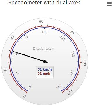
This is how we can create a gauge or speedometer chart with dual axes using highcharts library with required properties.