In bootstrap, the tooltip component is useful to show the HTML elements title attributes text on hover with a customized small pop-up style. The tooltips rely on CSS3 animations and data-attributes for the title to display as a tooltip.
To create the tooltips, the following attributes are required:
data-toggle="tooltip" attribute to toggle the tooltip feature for the selected element.title attribute for the text you want to get displayed in the tooltip.data-placement attribute it’s optional but required to set the direction of the tooltip on the top, bottom, left, or right side of the element.Following is the example of creating the tooltip for required elements in bootstrap.
In bootstrap, the custom style tooltips can be triggered with jQuery. So, you need to import the following script in order to initialize the tooltips.
The above script will initialize all the tooltips on a page with data-toggle attribute. If you want to enable the tooltip for a particular element, then call the tooltip() method with the id or class of the particular element.
The above example will return the result as shown below.
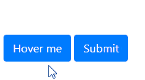
The bootstrap tooltips can be enabled for any element such as labels, images, input controls, etc., by adding the required attributes based on our requirements.
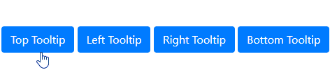
By default, the bootstrap tooltips will appear on the top of the element. However, you can change the direction of the tooltip to top, left, right and bottom by using data-placement attribute.
The above example will return the result as shown below.
In bootstrap, you can pass the different options to tooltip() method to customize the tooltip based on your requirements.
Following are the few important options which we can pass to tooltip() method in bootstrap.
| Name | Type | Default | Description |
|---|---|---|---|
| animation | boolean | true | It is useful to set the fade transition to the tooltip. |
| container | string | false | false | It is useful to append the tooltip to a specific element. |
| delay | number | 0 | It is useful to delay showing and hiding the tooltip (ms). |
| html | boolean | false | It is useful to allow HTML in the tooltip. |
| placement | string | 'top' | It is useful to specify the position of the tooltip. |
| title | string | '' | It is useful to set the tooltip text. |
| trigger | string | 'hover focus' | It is useful to set how tooltip to trigger - click | hover | focus | manual. You can pass multiple triggers by separating them with space. |
| offset | number | string | 0 | It is useful to set the offset of the tooltip relative to its target. |
The above tooltip options can set either through the data attributes or JavaScript. Following is the example of passing the options through JavaScript to tooltip() method.
If you observe the above code, we are passing multiple options to tooltip() method by using JavaScript. The above example will return the result as shown below.
Same like above tooltip options, we have different tooltip() methods to show, hide, or toggle the tooltips based on our requirements.
| Method | Description |
|---|---|
| .tooltip(options) | It is useful to attach tooltip options. |
| .tooltip('show') | It is useful to show the tooltip |
| .tooltip('hide') | It is useful to hide the tooltip |
| .tooltip('toggle') | It is useful to toggle the tooltip |
| .tooltip('dispose') | It is useful to hide and destroy the tooltip |
| .tooltip('enable') | It gives an element’s tooltip the ability to be shown. |
| .tooltip('disable') | It removes the ability for an element’s tooltip to be shown. |
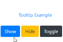
Following is the example of using tooltip() methods to show, hide, or toggle the tooltip based on the button clicks in bootstrap.
The above example will return the result as shown below.
In bootstrap, the tooltip classes have few events for hooking into tooltip functionality to fire the events during the showing or hide the tooltip.
| Event | Description |
|---|---|
| show.bs.tooltip | This event will trigger before the tooltip is shown. |
| shown.bs.tooltip | This event will trigger after the tooltip is shown. |
| hide.bs.tooltip | This event will trigger before the tooltip is hidden. |
| hidden.bs.tooltip | This event will trigger after the tooltip is hidden |
| inserted.bs.tooltip | This event will trigger after the show.bs.tooltip event before the tooltip is shown. |
Following is the example of using the events to show the alert message during the showing and hiding the tooltip in bootstrap.
This is how we can use the bootstrap tooltips in our applications to show the HTML elements title attributes text on hover with a customized popup style based on our requirements.